Valmare

Skincare / Beauty / Wellness
Re-Branding
Packaging
US
Valmare began as a small-batch skincare line rooted in botanicals, clean formulations, and holistic self-care but its original branding didn’t reflect that intention. It looked generic, didn’t resonate with the brand’s growing audience, and lacked a clear visual point of view.
The founders reached out for a full rebrand they had a loyal base, a compelling story, and high-performing products, but their identity wasn’t doing justice to the experience. They needed branding and packaging that felt modern, trustworthy, and sensorial without losing the grounding, gentle nature of the brand.
Summary
The Valmare rebrand was a shift from a generic, minimal skincare identity to a brand presence that felt grounded, intentional, and emotionally resonant. My approach combined clarity with subtle storytelling ensuring the brand looked and felt like a ritual, soft yet elevated, rather than just another skincare label.
Through design choices spanning logo, packaging, typography, and voice, we created a brand system that carried both restraint and recognition. The outcome wasn’t only aesthetic; the rebrand led to stronger recognition, press features, and increased customer loyalty.
This project reflects how I view rebranding: not as a surface-level update, but as a deeper alignment between what a brand stands for and how it shows up in the world.
Challenge
Rebranding is less about replacing visuals and more about recalibrating strategy. For Valmare, the challenge was to stand apart in an oversaturated “clean skincare” market without losing the essence of what the brand already represented.
The old identity blended in with countless other minimal brands it lacked memorability and failed to express the brand’s deeper values. Customers often confused it with competitors, and internally, the team found it difficult to maintain a consistent look and voice across platforms.
My task was threefold:
-Clarify the brand’s visual language so it could be distinct and recognizable.
-Design a packaging system that felt elevated and luxurious without being intimidating.
-Introduce storytelling elements that created an emotional bond with customers transforming the brand from just another skincare product into part of a personal ritual.
Solutions
The solution came from balancing restraint with resonance. My process was about creating a design system that looked refined and minimal, but also carried emotional depth and tactile appeal.
-Discovery & Strategy → I began by auditing the existing identity, mapping out where confusion occurred and where the brand had space to stand apart. Through research, I identified opportunities to lean into warmth, softness, and ritual while maintaining clarity.
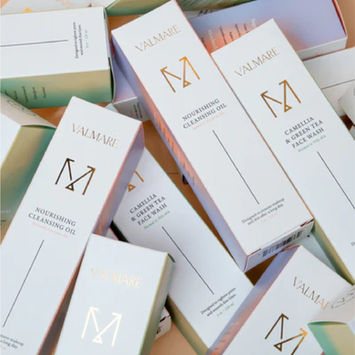
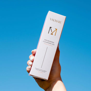
-Logo System → I refreshed the logotype and introduced an iconic “M” monogram. This element was intentionally simple and flexible, making it easy to apply across packaging, digital banners, and social touchpoints while building stronger recognition.
-Color Palette → I developed a grounding palette inspired by natural elements warm neutrals, muted gradients, and hues that feel like morning light on skin. The palette set a tone that was both calming and premium.
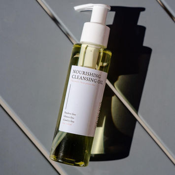
-Typography → I paired a timeless serif (for elegance and ritual) with a modern sans-serif (for clarity and usability). This combination worked seamlessly across tactile surfaces like glass bottles while also staying crisp in digital spaces.
-Packaging Design → I stripped away noisy claims and leaned into intentional simplicity. White space, texture, and finish carried the design. Details like foil stamping and embossing elevated the unboxing experience, giving customers a sense of care and sophistication.
-Tone of Voice → To ensure consistency beyond visuals, I developed brand messaging guidelines. The tone was thoughtful, warm, and minimal designed to feel like a conversation rather than a sales pitch across email, website, and social content.
-Systematization → Finally, I created templates and frameworks so the Valmare team could maintain consistency moving forward, reducing internal struggles with execution.
By anchoring every choice in the idea of “ritual,” the rebrand transformed Valmare into a skincare brand that felt both approachable and aspirational. The new identity not only gave them a stronger market presence but also built a deeper emotional connection with their customers one rooted in trust, care, and timeless design.


