Squeezy

Beverage / FMCG
Branding
Web design
Packaging
Chennai
Squeezy is a conceptual branding and packaging project imagined around the themes of freshness, ease, and a punchy personality. The concept began with a simple product idea a fruit-based “squeeze-and-go” beverage and evolved into a fully realized brand universe designed to connect with a modern, health-conscious audience.
The project was an opportunity to explore how bold visual systems can create instant recognition while communicating product benefits at a glance. Squeezy needed to feel approachable, energetic, and fun but also visually grounded enough to feel like a product you’d trust on a store shelf. This meant finding the sweet spot between playful personality and clear, premium presentation.
Summary
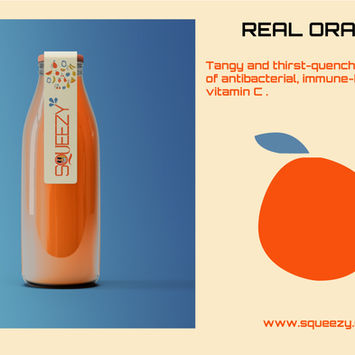
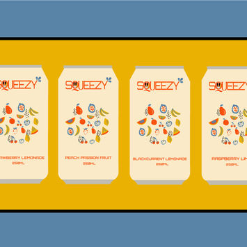
Squeezy was imagined as a fruit-forward beverage brand that could feel both fun and credible. The visual identity leaned into a vibrant color story inspired by nature’s juiciest tones ensuring each SKU felt distinct but still part of a larger family. Typography balanced friendliness with clarity, while playful iconography added a layer of personality that could flex from packaging to digital.
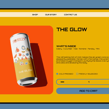
But the brand didn’t stop at the can. The system extended into lifestyle and digital touchpoints: fruit-themed icon sets for UI, branded tote bags for merch opportunities, and a custom e-commerce interface designed to carry the in-person personality online. From the curved graphics wrapping around each can to the smooth transitions of a mobile checkout, every detail was built to echo Squeezy’s core values joy, clarity, and everyday usability.
Challenge
The toughest part of Squeezy’s development was balance. On one side, I wanted the brand to feel fun, juicy, and approachable a drink that sparks joy at first glance. On the other, it had to maintain trust and quality, steering clear of looking like a children’s product. Too much play, and it risks being dismissed as gimmicky. Too little, and the spark is gone.
As a self-initiated project, the challenge went deeper: there was no client dictating direction, timelines, or strategy. That freedom was liberating, but it also meant I had to act as both designer and creative director setting constraints, building rationale, and ensuring the system could hold up in a real-world retail and digital context. The test was simple: could Squeezy stand proudly on a supermarket shelf and translate seamlessly to an online store without losing its essence?
Solutions
The solution started with defining three clear visual pillars the guardrails that kept the work both expressive and grounded:
-Bold, fruit-inspired palettes to telegraph flavor instantly.
-Playful, vector-based illustrations to capture joy without tipping into immaturity.
-Crisp, UI-friendly typography to ensure the brand could scale from a can to a checkout flow with ease.
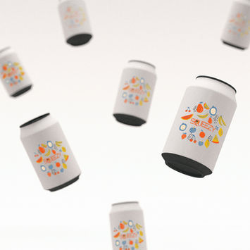
From there, the process was about testing these elements across real applications. On the can, curved layouts and layered graphics created a sense of movement, reinforcing freshness and energy. For digital, those same illustrations became icon sets and UI accents proving the system could adapt without breaking. Even in lifestyle extensions like merch, the color and iconography carried the same recognizable personality.
UX research principles came into play when mocking up the e-commerce site. I asked: How do we make the experience feel as joyful as the packaging, but just as functional as any serious online store? The answer was a clean grid system that mirrored the packaging’s rhythm: bursts of expressive visuals anchored by clarity and usability. That consistency built trust without sacrificing play.
In the end, Squeezy became more than a packaging project. It became a sandbox for exploring how brand identity can flex across mediums, how playful creativity can coexist with practical systems, and how self-imposed structure can elevate a concept from mood board to market-ready.

