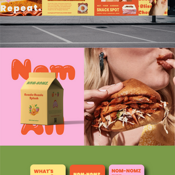
Nom-Nomz

Food & Beverage / QSR (Quick Service Restaurant)
Branding
Packaging
Marketing
Canada
Nom-Nomz is a fast food restaurant concept built around nostalgia, bold flavors, and a sense of playful rebellion. Inspired by the electric energy of the 90s, the goal was to create more than a place to grab a burger it had to be an experience.
The brand pulls from the visual chaos of retro gaming, snack packaging, and Saturday morning cartoons, then filters it through a modern design sensibility. The result? A quirky, high-energy identity that feels like your favorite childhood cartoon grew up, got a little sassier, and opened a burger joint. Every element from packaging to menus to social media was designed to be instantly recognizable, craveable, and worth sharing.
Summary
Nom-Nomz is proof that fast food branding can be both bold and collectible, designed to spark joy before the first bite. The vision was to create a brand that felt like an event in itself something that customers wouldn’t just consume but remember. By leaning into strategic nostalgia while pairing it with sharp, modern execution, the visual identity became an unexpected blend of past and present.
The goal wasn’t just recognition; it was to build an identity system that customers wanted to interact with. Packaging was treated like a collectible, with graphics that felt too fun to throw away. Menus doubled as posters, sauce labels became punchlines, and social media posts carried the same cheeky voice as in-store signage. Every touchpoint was designed to entertain, surprise, and connect creating a brand world that extended well beyond the food.
At its core, Nom-Nomz was about building a personality-driven ecosystem. It wasn’t branding in a vacuum; it was branding as theater, a shared cultural experience that worked seamlessly in physical spaces, digital platforms, and even as merchandise.
Challenge
The creative challenge came in two interconnected layers. The first was tonal balance: Nom-Nomz had to be playful without tipping into childishness. There was a real risk that if the brand leaned too far into whimsy, it would feel like it catered only to kids, turning away adults who craved fun but still wanted quality. On the other hand, if it dialed back too much, it would lose the energy and irreverence that made it unique.
The second challenge was differentiation in an oversaturated market. The fast food landscape is noisy, with competitors either chasing sleek minimalism to signal “premium” or diving into hyper-themed, chaotic visuals that had no structure. Nom-Nomz needed to cut through the clutter but do so with discipline. The risk of inconsistency was high, especially with a system that had to live across packaging, menus, in-store graphics, event signage, sauces, and social media.
In short: the brand had to feel exciting but not gimmicky, consistent but not boring, collectible but not cluttered. Missing that balance could have easily made the system feel either overwhelming or forgettable.
Solutions
I approached the project as a process of layering strategy with design play ensuring that every bold choice had a system behind it.
1. Defining the Brand Story
The foundation was “familiar but fresh.” I drew inspiration from retro arcade games, collectible sticker packs, and 90s fast food wrappers cultural references that spark nostalgia while leaving space for reinvention. This story became the filter through which all design decisions flowed, ensuring every touchpoint carried both energy and intention.
2. Establishing Structure
With such a bold aesthetic, structure was critical. I created a consistent type hierarchy and grid system that acted as an invisible backbone. This allowed oversized graphics, wild patterns, and punchy phrases to exist together without losing hierarchy or clarity. By defining rules early, I could give the brand room to play without breaking itself.
3. Visual Language & Illustration
Illustration became the connective tissue. I designed mini mascots playful characters that could live as icons, patterns, or standalone heroes. These became instantly recognizable and allowed flexibility in application: on a sauce bottle one day, on a mural the next. They made the brand feel alive and adaptable.
4. Packaging & Menus
Each piece of packaging was treated like a collectible. Bags, wrappers, and cups weren’t disposable; they were designed to be part of the experience, the kind of thing you’d want to photograph or keep. Menus were built for impact bold visuals, short copy, and a layout that felt as entertaining as scrolling a feed. In both physical and digital contexts, the design was about quick hits of delight.
5. Verbal Identity
The copywriting carried as much weight as the visuals. Phrases like “bite me” or “too hot to handle” gave Nom-Nomz a personality that was cheeky, confident, and slightly rebellious. This tone unified the brand across signage, packaging, social captions, and even loyalty cards, ensuring the voice was as consistent as the look.
6. Collaboration & Iteration
Throughout, I worked closely with the team to test how designs translated across environments. A flat digital mockup often looked different once wrapped around a cup or blown up on a banner. I refined based on scale, texture, and user interaction ensuring designs worked not just as visuals but as experiences.
By treating the process as both strategic and playful, I delivered a system that could flex widely without ever losing its core identity. The result was a brand that didn’t just enter the fast food market, it disrupted it. Nom-Nomz turned everyday branding into an event, creating a lasting impression through a mix of nostalgia, boldness, and consistency.


