Next Naturals

Agriculture & Sustainability
Branding
Marketing
Gujarat
Next Naturals is an agro-based company from India aiming to create a professional, trustworthy brand identity that could translate seamlessly across both digital and print platforms. With a focus on agricultural products and services, they wanted their visual presence to feel rooted in nature yet forward-looking enough to reflect their ambitions for growth.
I was brought on board as a freelance designer to build their visual foundation from the ground up starting with logo development and extending into a full suite of branded collateral. This wasn’t just about aesthetics; it was about giving a relatively young brand the credibility and presence to stand alongside established players in the agro-industry.
Summary
From the outset, the goal was to create a design language that felt grounded yet contemporary. Natural, earthy tones formed the base, paired with clean, modern typography that spoke to the company’s forward-facing aspirations. Layouts were kept fresh, simple, and highly adaptable across both print and digital formats, reinforcing clarity and consistency.
Beyond executing the creative work, I served as a guide throughout the process, helping the client navigate branding decisions in real time. With multiple stakeholders involved, the project required not just design skill but also diplomacy presenting options clearly, walking through the rationale behind choices, and keeping the brand’s core story intact amid changing requirements.
The end result was a cohesive brand identity that blended authenticity with professionalism. It delivered a system that was as practical as it was visually distinct, giving Next Naturals a confident and adaptable presence across all platforms.
Challenge
This project highlighted the dual role of a designer: creative partner and process manager. While the visual goals were clear, the business direction itself was still evolving as the brand identity was being developed. That meant navigating frequent shifts in priorities, timelines that were stretched and adjusted, and design decisions that were sometimes revisited after initial approvals.
The logo, in particular, became a focal point of this dynamic. Even after a final design had been agreed upon, the client reconsidered and requested revisions, pushing the process back several steps. Similarly, the digital side of the project presented hurdles: the web banners had to align with a developer’s technical requirements that weren’t communicated upfront, requiring additional adjustments and coordination.
These challenges tested both patience and workflow. The creative process had to remain flexible without losing direction, and the client relationship had to be carefully managed to ensure trust and momentum weren’t lost. Ultimately, the challenges underscored how much successful branding relies not only on visuals but on clear communication, adaptability, and relationship-building.
Solutions
The approach to building Next Naturals’ identity was as much about process as it was about aesthetics. With a moving target and evolving client needs, I leaned into structure and adaptability, ensuring each phase of the project brought clarity while still leaving room for organic shifts.
Phase 1: Discovery & Visual Foundations
The project began with grounding the brand in its essence: natural, earthy, and trustworthy. I explored palettes inspired by agricultural landscapes greens and browns paired with softer neutrals and matched them with typography that felt clean and contemporary. Early conversations centered around aligning stakeholders on what “Next Naturals” should represent: a bridge between tradition and innovation. This stage set the tone and provided the visual vocabulary for everything that followed.
Phase 2: Logo Exploration & Refinement
The logo was the heart of the brand system, and also the most iterative part of the process. Initial directions emphasized organic forms with modern simplicity, but as the client’s business focus shifted, so did their expectations. When revisions were requested even after a “final” version had been approved, I reframed the process: rather than seeing it as backtracking, I treated it as an opportunity to refine the mark’s storytelling. Each iteration was presented with context why certain shapes conveyed growth, why spacing choices impacted legibility, how subtle changes in weight shifted tone. This not only provided the client with clarity but also built confidence in the decisions being made.
Phase 3: Brand Collateral Development
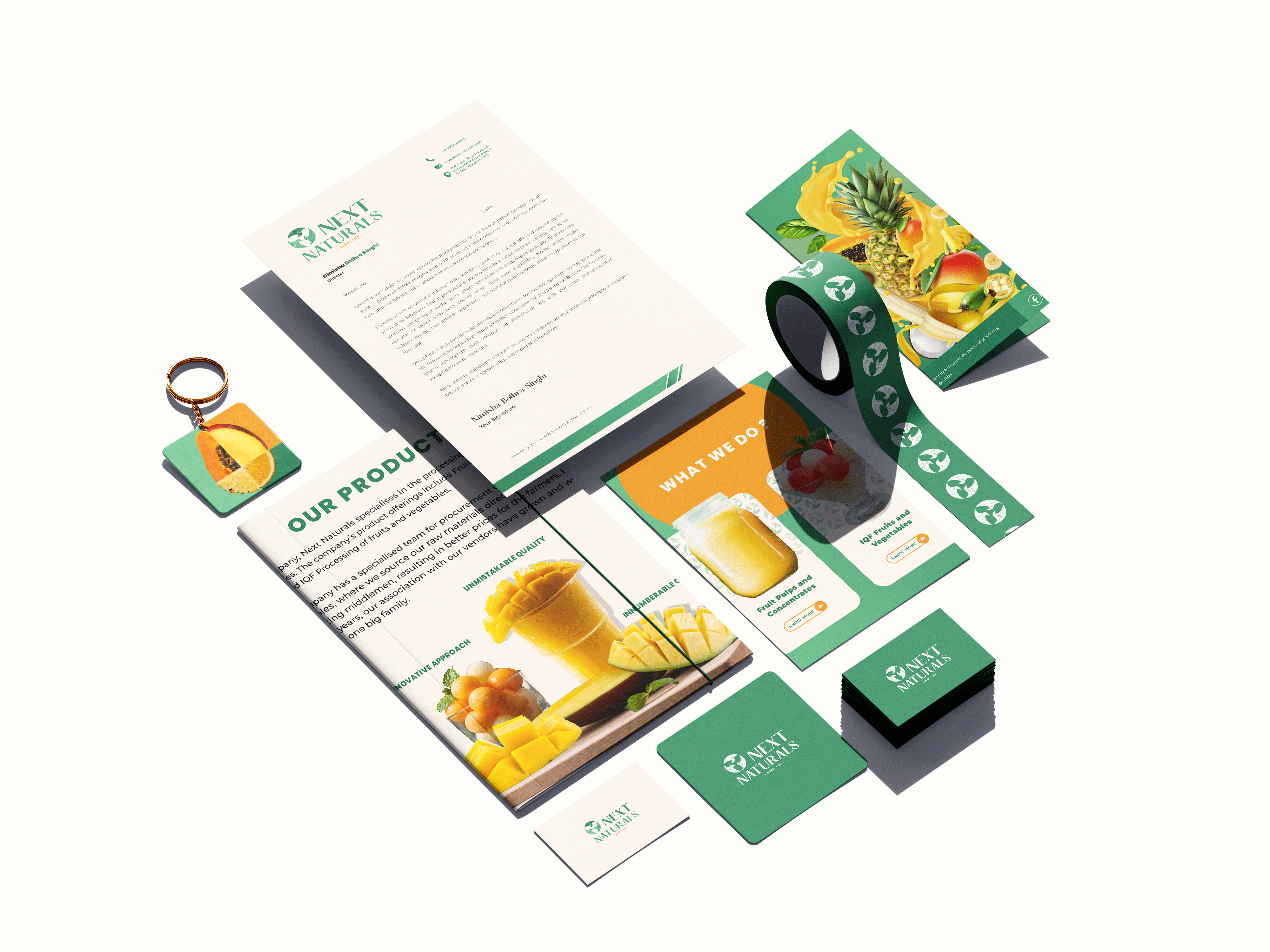
Once the logo was solidified, I extended the system into practical applications: business cards, letterheads, email signatures, and brochures. Here, cohesion was key. I created a set of visual rules that balanced consistency with flexibility, so the identity felt unified across touchpoints but not repetitive. Each piece was designed with a dual purpose rooted in warmth and authenticity, but polished enough to communicate professionalism in client-facing interactions.
Phase 4: Digital Assets & Developer Collaboration
The final deliverables included a series of web banners, which introduced another layer of complexity. The developer’s technical specifications were unclear at first, so part of my role became translating design into execution. I worked closely with their team to align file formats, sizing requirements, and responsive considerations, ensuring the banners not only looked visually cohesive but also functioned seamlessly on the web. This collaboration reinforced the importance of bridging design and implementation, especially in digital environments.
Phase 5: Client Education & Relationship Building
Throughout the process, I acted not only as a designer but also as an educator. Each presentation was accompanied by rationale: why specific fonts were chosen, how the earthy palette reflected authenticity, how the layouts balanced hierarchy with whitespace. By providing this transparency, I guided multiple stakeholders through the decision-making process, helping them see the “why” behind every “what.” This turned revisions into conversations rather than conflicts and helped maintain momentum despite shifting requirements.
Outcome
The final brand identity was more than a collection of assets, it was a system that embodied the dual spirit of Next Naturals: grounded in agricultural tradition, yet forward-looking and adaptable. While the journey was nonlinear, the process revealed the strength of flexibility and communication. What began as a moving target became a polished, cohesive identity that gave the client confidence in their visual presence and provided them with tools to grow their brand across mediums.


