Liquid IV
Food & Beverage (Hydration)
Branding & Packaging
Canada
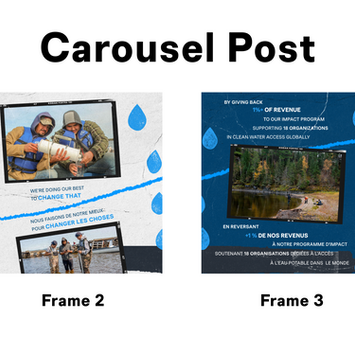
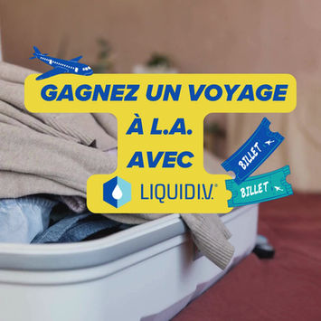
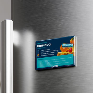
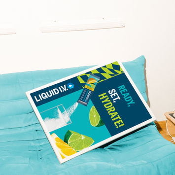
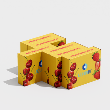
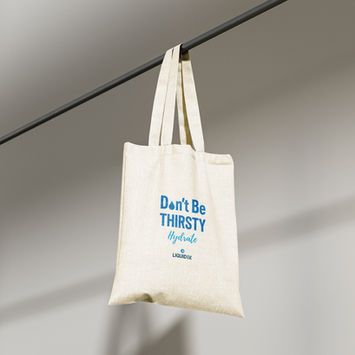
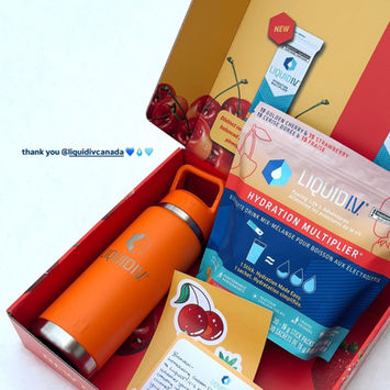
At Ketchum, I worked on a diverse range of creative assets for Liquid I.V., a hydration and wellness brand with a strong, vibrant personality. My role covered everything from packaging design and large-scale event banners to smaller but equally important touchpoints like tablecloth designs, note cards, infographics, and presentation decks. Each piece had a different audience and purpose some needed to catch attention in a busy event space, while others had to feel personal and polished in a one-on-one interaction.
Throughout the process, I focused on storytelling through design making sure every asset felt connected, told a piece of the brand’s bigger story, and evoked the same sense of energy and freshness that defines Liquid I.V..
Summary
This project with Liquid I.V. became an exercise in both versatility and discipline. It required me to navigate between multiple creative streams at once, shifting gears quickly without losing the brand’s clarity or consistency. One day I would be scaling visuals for a massive trade show wall designed to grab attention from across the room, and the next I would be refining the delicate details of a printed note card meant to feel personal and tactile.
What stood out most was the transition from digital to physical. Designing for print and large-format environments demanded a sensitivity to material, scale, and how the design would be experienced in real life. Beyond layout and typography, I had to think about paper textures, color fidelity in print, and how designs held up when seen at different distances. By the end, I had sharpened my ability to see how every asset whether bold and attention-grabbing or subtle and intimate plays a role in delivering one seamless brand experience.
Challenge
The primary challenge was managing speed and precision simultaneously. Agency timelines moved quickly, and requests often came in from multiple directions at once. Each deliverable had unique objectives and technical requirements, yet all needed to reflect the same recognizable voice of Liquid I.V. no matter the format or scale.
Another challenge lay in adaptation. A design that looked perfect on a digital screen didn’t always work once translated into the physical world. A textured tablecloth muted colors differently than a backlit screen, while a towering event banner needed immediate impact in ways a small printed infographic did not. Each context required its own strategy around visibility, hierarchy, and readability.
The task wasn’t just about designing assets it was about anticipating how each piece would live in its environment, while ensuring that, together, they formed a cohesive ecosystem. The challenge, in essence, was creating harmony between speed, scale, and brand consistency in a fast-paced, multi-channel environment.
Solutions
My process started with clarity. Before opening a design file, I broke down every request into three guiding questions:
-Purpose → What action, impression, or feeling should this asset create for the audience?
-Environment → Where will it be experienced, and how do scale, distance, and material affect design decisions?
-Connection → How does this piece reinforce and extend the wider brand narrative?
With this framework in place, I could adapt designs confidently without diluting the brand voice.
-Large-Format Assets → For trade show banners and wall graphics, I designed for quick impact. Bold imagery, minimal copy, and strong hierarchy ensured clarity from a distance. These pieces functioned almost like billboards designed to capture attention in seconds.
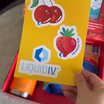
-Printed Collateral → For items like note cards, infographics, and invites, I shifted to precision and detail. Layouts emphasized readability, tactile quality, and a sense of personal connection.
-Internal Presentations & Decks → I created systems for logical flow and rhythm, using design psychology principles to guide the eye. Typography established hierarchy, color placement directed focus, and a balance of imagery and whitespace kept content engaging without overwhelming.
Throughout the project, I leaned on design psychology to make each asset feel effortless to navigate:
-Color placement directed attention to key messages.
-Typography created clear entry points and hierarchy.
-Layout rhythm gave long-form content a natural flow.
Collaboration was another crucial part of the solution. I worked closely with marketing and accounts teams, asking the right questions up front to reduce back-and-forth, anticipate technical requirements, and avoid rework once pieces went into production.
By structuring my process this way, I kept quality high under tight timelines, ensuring every asset not only looked polished but also worked strategically for the brand. Together, the pieces created a unified experience whether someone was encountering Liquid I.V. at a bustling trade show, holding printed collateral in their hands, or engaging with internal presentations.

