Calma Collective

Wellness / Lifestyle
Packaging
Social Media
Marketing
Bangalore
Calma Collective is a wellness brand rooted in mindfulness, nourishment, and intentional living. Their product range from soul food to scented candles and guided journals is designed to bring calm into everyday life. My role was to shape and amplify their visual presence through cohesive content, print collateral, and product design, ensuring that every touchpoint reflected their mission of fostering balance and mindfulness.
Over the course of a long-term collaboration, I worked closely with the Calma team to strengthen their brand voice, refine their visual identity in execution, and translate their ethos into products and campaigns that resonated with their audience.
Summary
My work with Calma Collective spanned multiple disciplines, from digital marketing and social content to packaging and print design.
On the digital side, I:
-Created engaging Instagram reels and thoughtfully designed static posts to boost engagement.
-Developed campaign concepts rooted in storytelling, focusing on the emotional connection between the brand and its audience.
-Maintained consistency across all visual content, ensuring a seamless online experience.
On the product and print side, I:
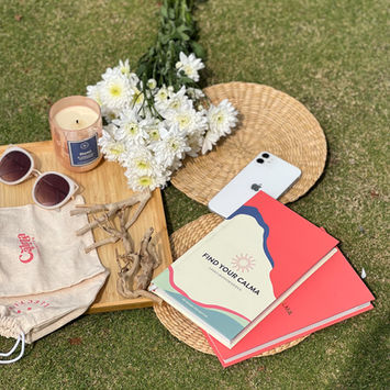
-Designed Calma’s best-selling gratitude journal, integrating guided prompts, calming layouts, and tactile design elements that encouraged daily mindfulness.
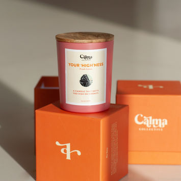
-Created candle labels for multiple collections, adapting tone and style for each scent from lighthearted and playful to serene and minimal.
-Developed brochures for both print and digital use, making them visually aligned, easy to navigate, and informative for customers and partners.
Through this combined approach, Calma Collective carved out a distinctive, welcoming identity within the crowded wellness market, staying true to its essence while standing out visually.
Challenge
The wellness category tends to fall into the same visual shorthand: pale neutrals, soft gradients, and minimal typography. That look can be calming but it also makes it very easy to fade into the background. My challenge with Calma Collective was to keep the brand’s gentle, mindful spirit while making it distinct, warm, and memorable across very different touchpoints.
Practical tensions made it trickier: product packaging had to feel tactile and ritualistic; social content needed to be lively and shareable (reels, not static squares); printed brochures and a guided journal needed editorial rigor and tactile quality; and everything had to read like the same brand despite different formats and audiences. In short: how do you translate a quiet, soulful identity into energetic reels, intimate product experiences, and clear marketing materials without losing the brand’s calm core?
Solutions
I treated the work as a translation problem: the brand already had a voice; my job was to translate it coherently into motion, objects, and marketing and to make those translations repeatable. Here’s the step-by-step process I followed and why each step mattered.
1. Audit & alignment (why: avoid drift)
I started by reviewing the existing identity, product line, past content, and the founder’s goals. That helped me identify what felt essential (the warmth, the breath, the tone) and what could flex (color accents, motion language). Having that alignment up front prevented the “one-off” content problem where reels look nothing like packaging.
2. Tone & visual framework (why: create rules that free creativity)
Rather than prescribe every detail, I defined a compact framework: a core palette, an accent palette for different scent moods, typography scale, and a motion language (short cuts, breathy pauses, gentle reveals). These rules gave creative room while keeping everything recognizably Calma.
3. Content system for social (why: make content repeatable and on-brand)
I mapped a simple content pipeline: concept → storyboard → template → publish. Reel concepts focused on moments that reflect daily calm (rituals, product-as-tool, micro-stories), while templates ensured motion, pacing, and color stayed consistent. This made it possible to produce regular, on-brand video without rethinking the direction every time.
4. Product design & packaging (why: make the object feel like a ritual)
For candle labels and the gratitude journal, I treated materials as part of the message. I explored paper stocks, tactile finishes, and restrained embossing so packaging read as an experience, not just a wrapper. Each scent was given a mood-driven visual treatment (playful vs serene) within the same system so collections felt related but distinct.
5. Editorial & print (why: create a tactile ritual that supports use)
Designing the gratitude journal required editorial pacing: prompts, spreads, and white space designed to invite reflection. Paper weight, margins, and binding choices were selected to encourage daily use small decisions that affect whether a product becomes part of someone’s routine.
6. Production specs & handoff (why: protect the design through execution)
I produced clear specs for printers and developers (color swatches, die lines, video aspect rules, motion timings) so the design intent survived translation to final assets. This step reduces costly surprises and keeps real-world deliverables true to the concept.
7. Test, iterate, repeat (why: learn quickly and improve)
After launch, I reviewed early posts and product mockups, captured what resonated, and adjusted templates and packaging details. Iteration was lightweight but meaningful: tweak timing on a reel, slightly tweak a label texture, update a social caption tone. This kept the brand responsive and evolving, not stuck.
Outcome:
The approach kept Calma Collective visually cohesive across content, product, and print and it helped the brand feel both calming and distinct. The gratitude journal, designed as a tactile ritual, became a bestseller; social content maintained a consistent voice and visual language; and the product packaging now reads as part of a single, intentional ecosystem rather than disconnected pieces.


